
Church For Life Site
-
01 September 2016 |
-
11 November 2016 |
I’m not a religious person. However, I do believe in freedom of speech. One of the unwritten rules of free speech should be that if you’re going to have an internet presence, you should at least try to make the most of it. My parents’ church has (at the time of writing) a pretty bad site. It’s not well put together, confusing to navigate, and has an air of neglect. This doesn’t induce new users to interact with the site and consequently they’ll never hear the message. It’s not their fault; the person who set it up is not techy and did the best he could with what he knew. They also don’t have the almost infinite resources of the mega churches.
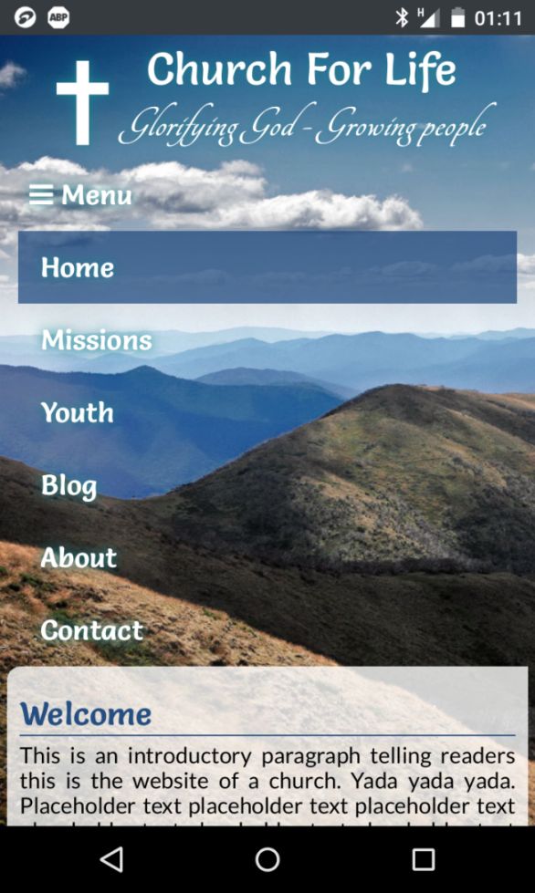
This looked like an opportunity for me to sharpen my Jekyll skills, so I jumped in and wrote them a blog site that performs the basic static functions a church would want (location, service times, etc); but also allows them to easily add new content to tell the world what they’re up to. It’s mobile friendly (of course), ready for social media sharing, and basically thoroughly modern in every way their previous site is (was) not.
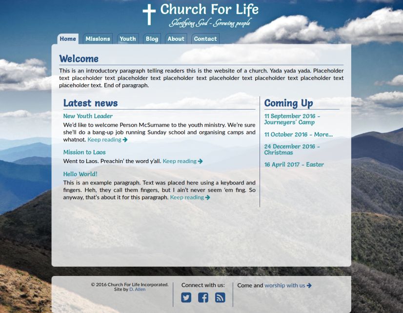
The build actually started off pretty badly. I made some poor decisions on colour scheme and was feeling pretty “meh” about the whole thing because it was just so ugly to look at while I was writing it. However, a happy accident resulted in the layout you see above. I chucked out the image I had been using as the background and went looking for an inspiring shot of the Great Dividing Range, which divides (funnily enough) Australia’s Eastern coast-line from the interior of the continent. After finding the shot (basically the first one on the Wikipedia page. It’s a great photo :), I was changing some of the colours to suit the new image and accidentally removed the header background altogether. “Hmmm, that looks cool, with all the menu buttons suspended against a beautiful blue sky like that… I wonder what else I can do with this?”
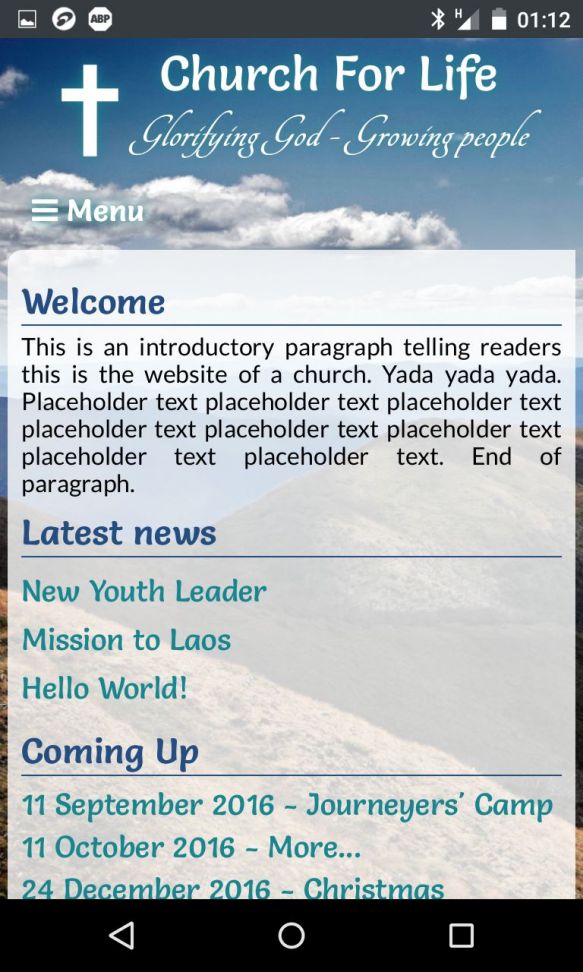
Getting rid of the previous hopeless colour gradient scheme of the main content and footer elements, and just going with a semi-transparent white gave the site a really nice open and airy feel. It was also a bit of a happy accident that lead to only rounding one of the corners to the menu elements, giving the illusion of sails and helping the airy theme along. It’s exciting, it’s inspiring, it’s interesting to look at - in short, it’s everything a church looking to get their message across could want in a layout. Well I think so, anyway ;)
But it’s not all layout, I also pushed my knowledge of Jekyll further with this build, using it in more comprehensive and complex ways than I had up until this point. I’m also applying some of the new things I’ve learned to the site you’re reading now :)
All in all, I’m quite happy with this one so far. I’ve just sent an email with a link to the site in its current “empty except for place-holder text” to the board members of the church for examination. The site’s not complete yet - there are functions, such as the social media icons, that need to be written, but I don’t want to spend any more time on it unless it’s going to see some use.